Have you ever heard of Type II fun?
It’s essentially the kind of experience that’s rough/ annoying/ interminable/ fatiguing/ exhausting in the moment, but then leads to something valuable/ beautiful/ glorious in the end. It’s an experience that’s fun after the fact. It’s fun to have done it… to have finished it.
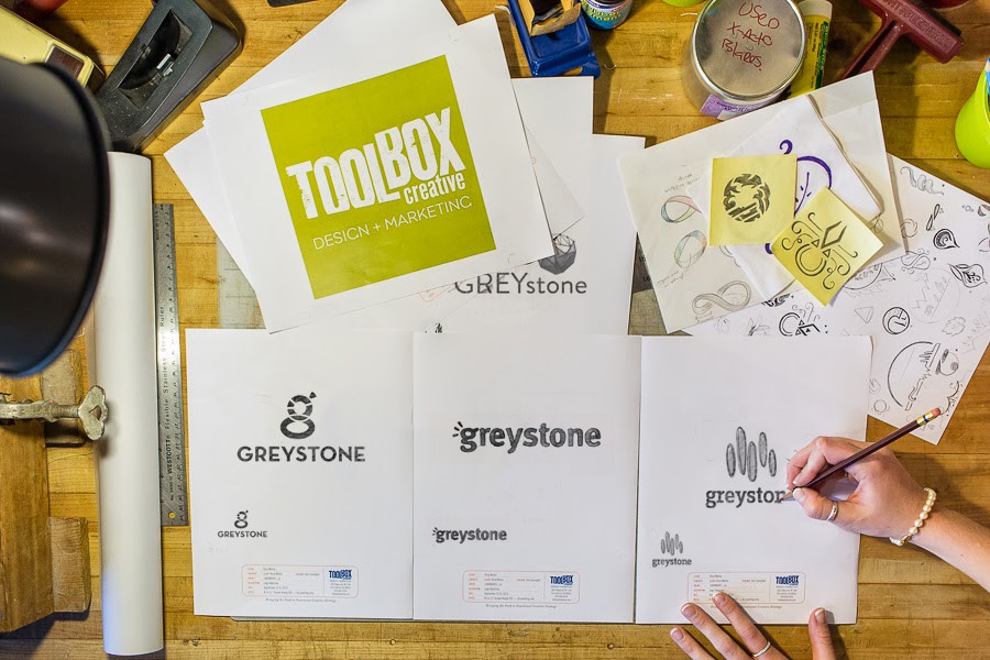
As we’ve shared widely, we’ve recently re-launched Greystone’s brand image. And as our Director of Business Relations, I joined Greystone’s principles in the rebranding process and it was fun to have a front seat to the process.
And by “fun,” I mean Type II fun.
Take several thoughtful, creative, insightful and strong-willed personalities and throw them in a room to discuss and debate images and messaging about the business that they’ve poured their hearts and souls into, and stir with input from an external, (mostly) objective source. Add in the pressures of continuing to run this thriving business, and throw in a dash or two of everyday life struggle and drama and… VOILA!
Greystone Technology Group and Greystone Web Services morph into Greystone Technology: One team. 5 service lines.
While it was a long, hard process, we are loving the results. Our partner in this process was Toolbox Creative, in Fort Collins and they knocked it out of the park. The visuals are fantastic and they really pushed us hard to refine our messaging.
I asked Dawn Putney, Toolbox’s Spiritual Cheerleader, to share her perspective on the process:
Greystone Technology gets it. They embrace the concept that a brand is more than a fancy new logo and catchy tagline. It’s about company culture — both internal and external. When the Greystone team approached Toolbox, they were ready, willing and able to make the shift in thinking about how they do business and how they tell their story. Change is no small undertaking. The Greystone team truly did “dig deep” to tell their new story — just like they dig deep for all their clients. It takes guts to be bold and different. That’s our kind of client, and we’re honored to be a part of the Greystone Technology rebrand process.
We love it when a plan comes together.
We do, too, Dawn. Even if it’s Type II fun to get there.
For those who nerd out on design and style guide type stuff, here’s a bit from our Brand Style Guide about our logos:
The Master Logo
![]()
Our logo is the visual representation of what we’re all about. It says who we are, what we do and how we do it. It’s solid but not square, fun but not silly, strong yet warm, professional yet approachable.
The three beams emanating from the lower case g represent connection, creativity and process. The containing shape with odd angles and rounded corners represents the technology ecosystem in which we work.
The Secondary Logo
![]()
Similar to the master logo, our secondary logo communicates our brand with clarity, consistency and personality.
The secondary logo should only be used in cases where the master logo cannot be used due to production limitations or legibility concerns.
Icon
![]()
In addition to the master logo lockup, the icon can be used as a social media icon, avicon and for other approved purposes.
If we were pirates, this would be on our flag.